Do virtual tours in museums meet the real needs of the public? Observations and tips from a visitor.
During the lockdown, more and more museums around the world are offering digital tours online: they could be virtual tours, live guided tours or even tours accompanied by a robot. For many, with museums closed, these opportunities provide access to a world of content from the safety and comfort of their homes. For others, it would be even better to calibrate them to meet human needs. Both virtual and real experiences hosted by the museums, in fact, have something in common: their visitors’ needs are always the same, online and live. For this reason issues such as cognitive bias, learning accessibility and universal design principles, that take into account visitors’ behaviours and motivations, are key factors for any effective experience.
What is your purpose? Do you want visitors to learn more about the significance of the works of art? Do you want them to have fun? Do you want to involve people who don’t usually attend museums? Do you want them to discover new strategies to approach artworks or to critically question their role as audience?
If you notice, the objectives of the virtual tours offered by museums are rarely made explicit and most of the time it doesn’t seem to be clear to the museum either. This generates a dissonance that makes it impossible to find coherence between visitors’ gestures and expectations. The most evident example: is a visit in which the artworks can be focused hardly will certainly not allow to deepen their value from the point of view of art history even if they could improve the interest for museums’ routes and architecture: in any case, it would be enough to know. As for the objective, it is a widespread misconception to think that a virtual visit could tempt you into actual attendance if you’re not already intrinsically motivated. Take a walk on “Google Street”: albeit there are some places in the world you would like to visit, it will not be because you simulated a walk through their virtual streets that your desire wil increase.
Tip: set clear goals and share your intention with your visitors on the website to orient their path and understanding.
Keep the pace
In the last few weeks I have interviewed people with different interests and experience, and while the research is empirical, it leads me to think that those who appreciate virtual tours are usually people of medium cultural level, used to visit museums; they are used to traditional approaches of visit for which the interpretation is not open, the visit is passive and does not raise other questions. In other words, for them the museum is only a space where specific and in-depth content is offered in relation to the objects, especially for artworks. The choice to discover the museum from home is often motivated by their desire to learn something new, to see places already visited in the past, to deepen their knowledge or to see unexpected details, hoping to be surprised.
Generally, visits especially when they are autonomous, as in virtual tours, tend not to last longer than what is considered the average concentrated attention span of about 7-10
minutes. In this sense, time should be observed following a qualitative and unprejudiced approach but more hooks to renew involvement and time would need to be included. About this topic, John Veverka (an expert in heritage interpretation), reminds us that a visit is not simply a matter of going from A to B, but of accompanying the visitor through the discovery of different and overlapping sensations and stimuli. In contrast, for many of the existing virtual tours the experience is nothing more than getting lost in a flat space, like a computer screen, unless it provides different strategies for interaction: the interface should be able to accommodate differentiated learning styles, to end up useful both in terms of accessibility and attention renewal. The opportunity to build connections and paths made by different types of stimuli and interactivity (music or perhaps open questions could be some examples) would increase engagement as well.
Tip: Facilitate your visit by offering different learning approaches, diversifying the contents and disciplines, developing your interpretation broadly as a strategy.
Learning can be skill-oriented
Expectations change according to the experience. As a museologist, for example, starting from the awareness that the museum is a learning device through which, hypothetically, everything is possible, I expect the spectrum of possibility to be further enriched by the online visit.
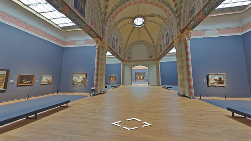
Google Art has done a lot in this area and produced extraordinary results, especially when it suggests observation strategies beyond focusing only on content, as for example in the case of the Vermeer’s Milkmaid painting on the Rijksmuseum’s website.
Life, of course, is easier if you are Google, but it’s not so much about resources as it is about learning objectives. In this case, in fact, the museum is suggesting the implicit
acquisition of skills which could turn out useful also in the real visit, as John Berger teaches in his famous book “Ways of seeing”. Moreover, the objective is clear and partly shifts from the more traditional proposal anchored to contemplation, effective only for a small number of visitors.
What I would like to see: more strategies and suggestions for the visit which people can then use in the real world and more references to current issues and pop experiences: if the museum is a real space, why should the virtual try to simulate it badly? Maybe this is an opportunity to bring virtually back the Mona Lisa to Italy? Or even: could we finally talk with visitors about museology and history of collections?
Peoples needs are always the same (Online and Offline)
Lidwell, Holden and Butler, in their fundamental book “Universal Principle of Design” (2012) talk about the importance of addressing a “hierarchy of needs” in good design: in order to achieve the goals we have set, we must be sure that we have responded first and foremost to the basic needs. Using Maslow’s most famous scale, it is therefore a question of imagining a pyramid that develops from the bottom upwards able to meet people’s basic needs before satisfying higher level’s ones. As it relates to our topic it would mean to structure devices that at the most basic level include functionality (they should work), reliability (they should work well), usability (they should be easy to use), proficiency (they should enable people to do something better), creativity (they should enable people to envision something new) at the highest level of the pyramid.
Tip: involve the whole staff with the question “What levels does our virtual tour reach?”, urging critical analysis and self-observation; test your virtual experience with different users, use UX and accessibility checklists or create your own.
Facilitate the understanding
Again, Veverka reminds us that to understand a part, you need to know the whole thing first. Try to think of a book: if the index was missing, wouldn’t you feel lost? Some of
the virtual tours (especially those guided in real time) place our user experience at a predetermined starting point without clearly sharing a larger picture or destination. While in a real visit, one can guess the approximate size of the museum, or the possible route one would take (often thanks to a map), in the virtual visit these references are often missing completely. Sometimes the museum map is not even available online, which makes the experience more like a maze than anything else. This key concept should obviously not be confused with the Principle of progressive disclosure which suggests to provide only the relevant information at a given time without overloading the recipient.
Tip: for any museum tours, especially those facilitated by a guide, allow visitors to always have a map available to frame the entire route from the beginning.
Tip: facilitate your visit by offering different learning approaches, diversifying the contents and disciplines, developing your interpretation broadly as a strategy.
In the flow
In a text still considered a classic in the field (Intrinsic Motivation in Museums: Why Does One Want to Learn?, 1999), Csikszentmihalyi and Hermanson described the flow experience as the optimal status that allows the visitor to feel completely involved and concentrated in the visit. According to their model, the flow is an intense and positive propensity to learning that occurs when we have just the right skills to face the challenges we meet. If our skills are higher than the challenges we get bored; if the proposal is too challenging, we end up anxious. In addition to the clear correspondence between skills and actions required, other aspects necessary for the activation of the
flow (and fatigue strength) should be: 1. clear objectives and defined rules 2. immediate unambiguous feedback 3. a positive state of mind 4. a sense of discovery and challenge, and no less important of all 5. intrinsic motivation. Some authors, such as neuroscientist Maryanne Wolf, say that since the digital age our flow experiences are inevitably compromised. She refers purely to reading, but I believe that this consideration can also apply to museums. Having said that, referring to flow as an ideal goal remains a good reminder for any projects audience-oriented.
Tip: as people have different abilities, knowledge and previous experience, make sure that your online experience offers multiple levels of access and allows you to perform different tasks.
Motivation is key
It all depends on motivation. If visitors online and in person are first motivated by the idea of living a pleasant experience, maybe with company, even online we should meet the same expectations. The truth, as Tiina Roppola tells us, is that the museum experience responds in a multidimensional way to different needs that can be simultaneously educational, exceptional, social, leisure oriented or many others.
Stephen Bitgood, a psychologist who has written a lot about the museum environment and its impact on visitors, describes motivation as a cognitive-emotional state to be strictly evaluated in a complex framework including the amount of perceived work and the number and intensity of distractions (2002). Motivation is powerful, not only because, when intrinsic, it is the key to activate the experience of the flow, but also because it allows us to overcome barriers. If I really want to do a virtual tour I will make every effort to understand how the computer works even if it is the first time I turn it on (of course, provided that this barrier is not impassable). Many hope that the virtual visit is a
worthwhile invitation to motivate non-visitors to go there: I have no data about it, but personally I doubt that those who have never been passionate about museums would become so now, unless the virtual experience is able to activate the construction of personal meanings.
Tip: offer a friendly experience, involve the visitors offering a range of free-choice activities, support their own construction of personal meanings by engaging them and asking questions (as well as their opinion).
Attention and distraction
As we mentioned in the case of the flow, there are many factors that limit our attention, especially if our motivation is not high. The Principle of Cost – Benefit is always valid: we will take an action only if we perceive that its benefits are equal or superior to the efforts. For example it can change a lot if we interact from a phone or a computer: the size of the screen has an impact on our effort, inversely proportional to accessibility. Moreover, if the attention is not stimulated (as it could be by an interactive activity or through the alternation of different learning styles) so many disturbing factors that can limit involvement, including things as simple as the table or work environment around the computer is in disorder. For facilitating attention, virtual visits (as well as the real ones) must be built with the importance of rhythm and timing in mind. For example, several authors, (including Falk, Koran, Dierking, & Dreblow, 1985) made clear that attention decreases over time: for this reason, if we assume visits of fixed duration, at least from the second half of the visit we should implement different strategies from the initial ones, just to avoid tiredness and fatigue.
Tip: as Susan M. Weinschenk (2011) suggests “if you must hold attention longer than 7–10 minutes, introduce new information or a break”.
Autonomy: You have to know how to manage it
On virtual tours visitors often rejoice in autonomy. As on Google Street they can move freely in space, but generally the euphoria fades away soon because the experience is always the same: after 10 minutes the experience doesn’t keep them engaged enough and boredom sets in. Unless they have a specific and personal interest to go deeper, their autonomy is limited because their actions cannot generate significant consequences.
On the other hand, allowing visitors to make too many choices independently risks paralyzing them, as happens in those pages that offer too many resources (but even in this case there are many pros and cons). Once again it is about the flow theory.
Tip: facilitate the visitor’s experience by sharing with them some strategies or suggestions for the visit, according to their interests, expectations and time available.
Tip: offer a friendly experience, involve the visitors offering a range of free-choice activities, support their own construction of personal meanings by engaging them and asking questions (as well as their opinion).
Other key questions
Of course, many considerations are still open. Above all, it is important to remember that there are no absolute solutions: everything lies in the quality and human-centred approach with which each proposal is structured. As was stated at the beginning of this analysis, human needs are the same whether the means of delivery are live or online, but on the contrary people may not always be the same, as they may experience the same visit more than once and perceive (and behave) differently each time.
Other key issues to consider certainly remain: how to solicit social interactions between visitors, themselves or their families, how to build long-term relationships between the museum and visitors and above all how to expand research on this investigation. This last point, more than the others, deserves an in-depth examination especially with regard to the formative evaluations necessary to implement a product that tailors its function and satisfaction to the experience of different users. There are many relevant projects that already allow us to approach the digital content of museums without virtuosity, especially when, as museums, we do not have the resources or skills to do so. But of course we also need new ideas, revealing the potential of this field, spreading new ways of interaction and also new interpretative approaches. Just remember to always ask for feedback from your visitors: they may seem to be only virtual people and instead they are not.
Maria Chiara Ciaccheri
