Colour Curatorship: Guiding the Visitor Experience through Exhibition Design
by Giulia Barigelli - Communication Manager, We Exhibit
While artworks are the heart of the scene, the color context adds value and enhances the visitor's experience.
Studies on the psychology and perception of color highlight the significance of this element in shaping our emotions and worldview. Colors go far beyond aesthetics; they are powerful tools of communication that influence our behavior and mood, functioning as a universal language that speaks directly to our subconscious.
In the art world, colors carry meaning and associations, reflecting the artist's symbolism and distinctive style. Think of the famous 'Klein blue' or the vibrant 'Titian red.' Each color evokes deep emotions and stirs powerful sensations, contributing to a unique and memorable visit.
As Josef Albers (Bottrop, Germany 1888 – New Haven, United States 1976), one of the foremost figures in 20th-century geometric abstraction and known for his explorations of color 'interactions,' once said: 'In visual perception, a color is almost never seen as it truly is, but as it appears in relation to its surroundings and our individual experiences.'
Indeed, color is intimately connected to our personal perceptions and environment, creating a unique emotional and sensory dialogue that enriches the experience.
“Colours are living beings, highly evolved individuals who integrate with us and with everything in the world.”
Yves Klein
(Nice, France 1928 – Paris, France 1962)
In the world of exhibition design, understanding the properties of color is essential for creating engaging projects. In fact, careful color design can truly revolutionize the visitor experience, transforming it into something extraordinary.
Let’s explore how.
Beyond the artwork
Exhibition design goes far beyond simply arranging artworks; color choices are never random but carefully and strategically planned. Colors can enhance the exhibition's theme, create immersive atmospheres, or draw attention to specific works.
Warm tones can create an intimate, welcoming ambiance, while cooler tones may suggest a larger space—though sometimes at the risk of making it feel sterile. Brightly colored corridors can guide visitors, indicating the exhibition's progression. Similarly, varying colors across different sections can help distinguish themes or highlight key works, ensuring a cohesive journey through the exhibition. Bold colors, on the other hand, can evoke feelings of alienation or tension, shaping the visitor's emotional experience.
Given the complexity of this subject, we invite you on a special chromatic journey through some of the projects we've worked on over the years, offering a deeper understanding of this approach.
Start your visit
Imagine crossing the threshold of a space filled with bright and vibrant colours: what feeling would it evoke in you?
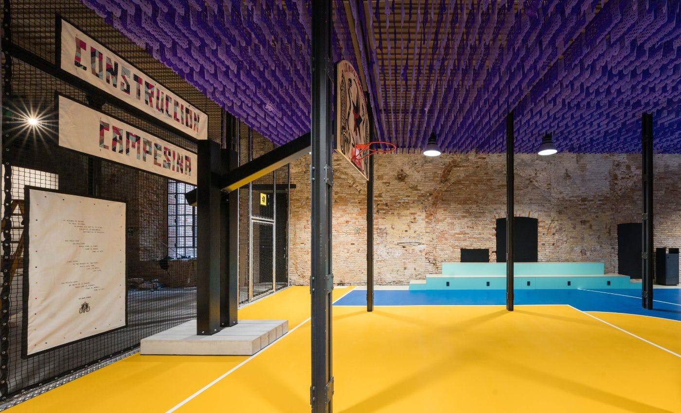
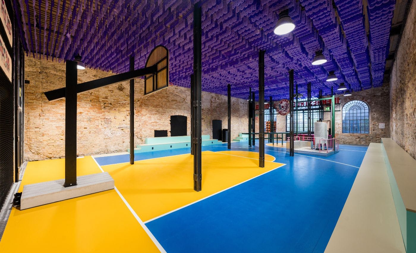
Pavilion of Mexico, Utopian Infrastructure: The Peasant Basketball Court, Venice Biennale, Architecture 2023
In 2023, we collaborated on an extraordinary installation for the Pavilion of Mexico: a rural basketball court, painted in bold shades of yellow and blue, set against the picturesque backdrop of the Salone delle Armi at the Venice Arsenal. The vibrant colors immediately capture the audience's attention, drawing the eye to this striking scene. This project was designed to provoke reflection on significant themes in the country’s social history.
A vibrant, dazzling yellow also featured in the Pavilion of Turkey of 2021. Here, the wall color and intense lighting flatten the surrounding space, creating a disorienting effect. This installation was designed to emphasize the connection between the everyday and the global context, advocating for a more active role for architecture in the contemporary world.
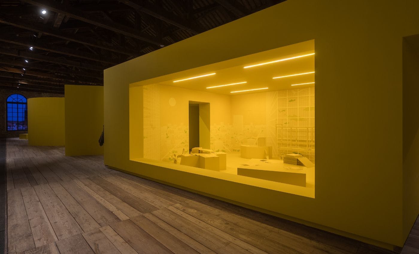
Pavilion of Turkey, Architecture as Measure, La Biennale di Venezia, Architettura 2021
Speaking of disorienting sensations, we must mention the 2022 Venice project, Alice in Doomedland, a thematic exhibition held at Palazzo Bonvicini by the Fondation Valmont and curated by Luca Berta and Francesca Giubilei. This contemporary reinterpretation of Alice in Wonderland was designed to guide visitors on an inner journey, featuring oversized objects, neon text, and striking color contrasts. It’s a sensory-rich experience, where the deep purple symbolizes the hidden realms of the unconscious, while the yellow represents light and self-awareness.
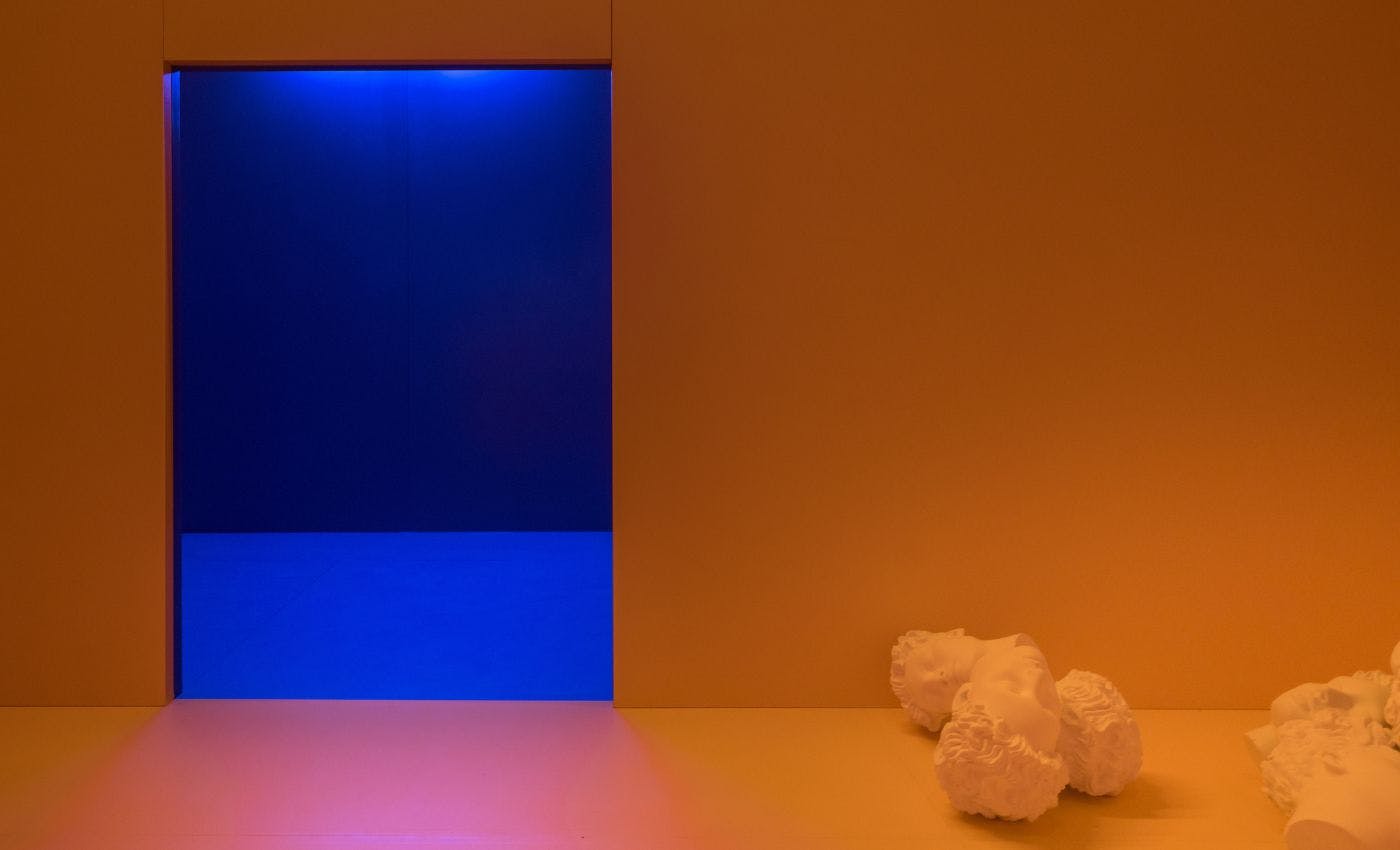
Alice in Doomedland, Palazzo Bonvicini, 2022
Finally, our journey brings us to a sea of bright blue, reminiscent of the Pavilion of Belgium in 2018. A large amphitheater fills the entire building, inviting reflection on the pressing issues faced by the European Union at the time, many of which remain relevant today. The blue, both calming and inspiring, imbues the space with the atmosphere of a sanctuary. It is an environment suited for hosting large crowds, yet intimate enough for individual visitors to embark on their own personal journeys of discovery.
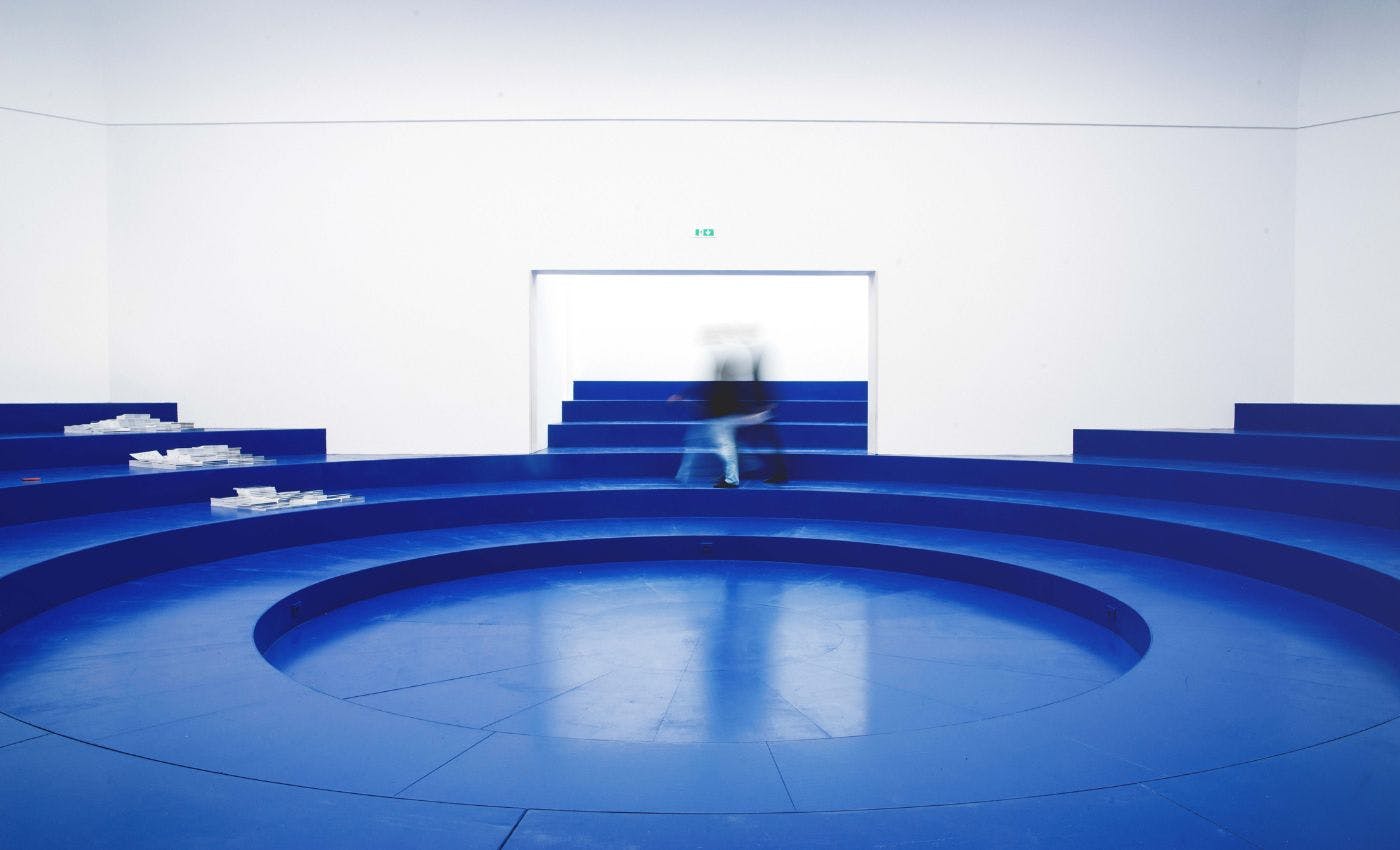
Pavilion of Belgium, Eurotopie, La Biennale di Venezia, Architettura, 2018
As we've seen from the examples provided, the use of specific tones can be a powerful tool to enrich and elevate the overall experience of an art exhibition, helping visitors connect more deeply with the works and share a meaningful, memorable encounter.
Have you ever visited an exhibition or project that particularly impressed you with its color choices?
-
Giulia Barigelli
Communication Manager
